AI can produce a hundred lessons quickly. It can also produce a hundred versions of the same beige article: vague hook, anonymous “research,” five tips, motivational close. Scaling useful content required us to engineer judgment, not just generation.
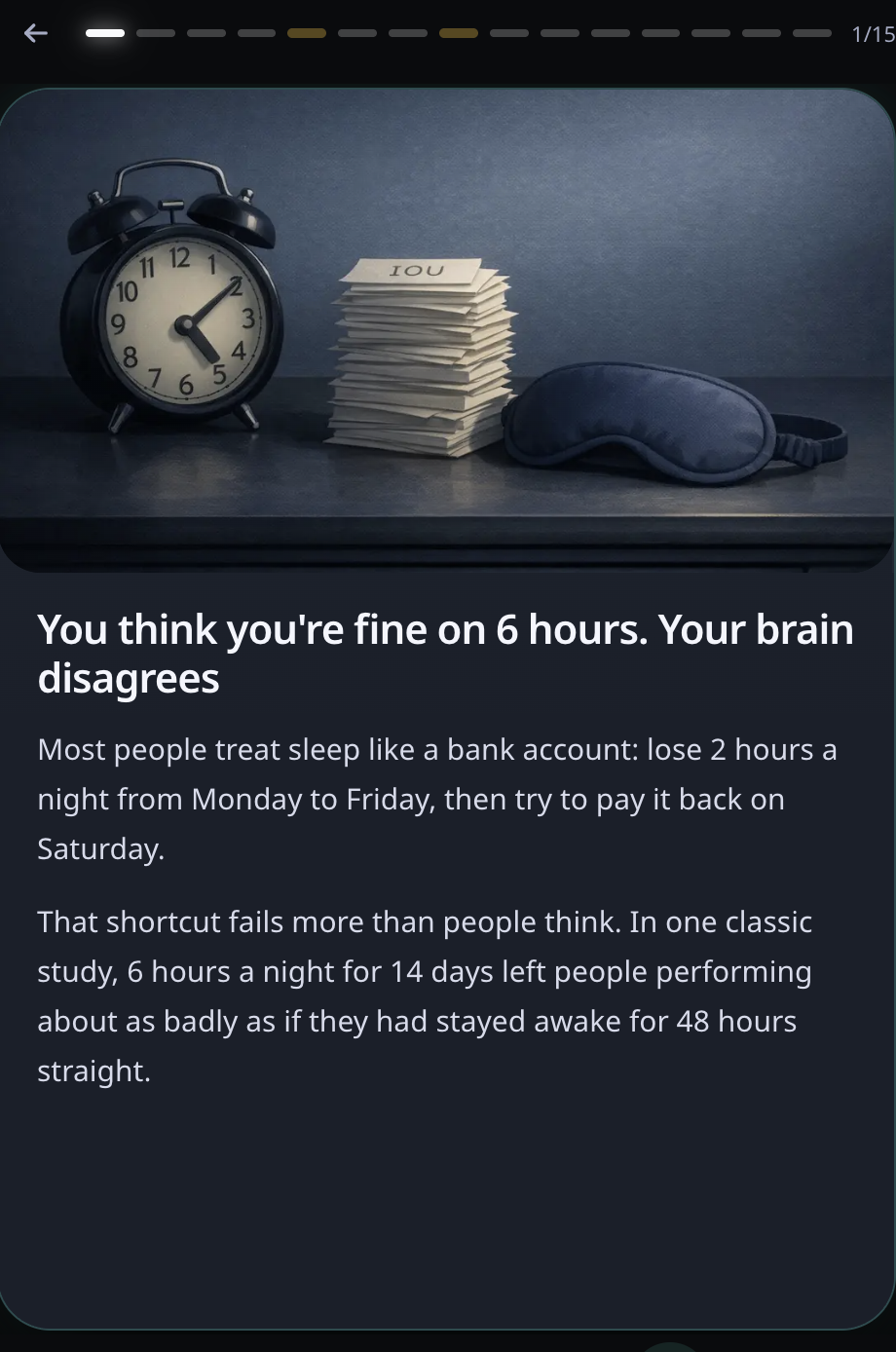
Rebuilt is a mobile life-skills product for people who want practical help with sleep, focus, energy, money, food, stress, posture, relationships, online pressure, and the other systems adulthood quietly expects you to understand.
The repository currently contains 203 canonical lessons across 21 modules and 1,683 lesson steps. At that size, “write good copy” is not a process. We needed a content architecture that could keep the lessons evidence-aware, scannable on a phone, consistent in voice, safe around sensitive subjects, visually coherent, and identical across authoring files, runtime JSON, and the database.
The result is content-as-code with a fairly opinionated editorial operating system.
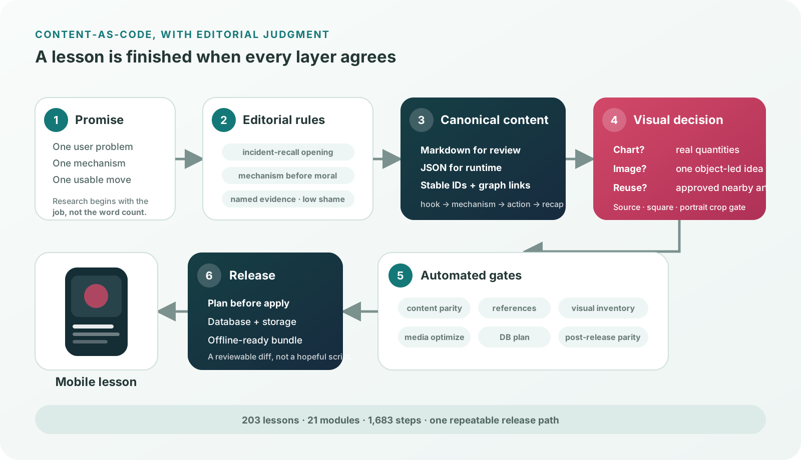
Begin with one promise
Every lesson starts by answering three questions:
- What obvious problem is this helping with?
- What should the reader understand after about a minute?
- What should they be able to do after finishing?
That produces the lesson’s spine. One lesson gets one main promise; one card gets one job. If a card is teaching two mechanisms or asking for three unrelated actions, it is split. If two cards repeat the same move, one goes.
Most shipped lessons use five to seven steps:
recognizable hook
→ plain-language mechanism
→ evidence or visual model
→ quick check
→ small action
→ compressed recap
The schema allows more depth when the topic needs it, but length is not treated as quality. A useful action card may be two sentences. A difficult mechanism may need two separate science cards rather than one wall of text.
Every lesson also has durable metadata: a stable ID and slug, module, depth layer, format, XP, tone, blueprint-card rewards, prerequisites, related lessons, unlocks, sources, and further reading. Titles can improve without breaking references because the visible name is not the content identity.
The voice is an older sibling, not a coach
We wrote an explicit voice standard because “make it human” is too vague to review.
Rebuilt should sound like a smart older sibling who figured something out and is passing it on directly. It is not a therapist, a lecturer, a life coach, or a wellness brand. That creates several reusable writing patterns.
Open on an incident, not a category
Weak:
Many people struggle to maintain focus in today’s distracting environment.
Rebuilt-shaped:
You meant to start the draft. Then you checked one notification. Then another. Now forty minutes are gone.
The second version does not tell the reader which demographic they belong to. It gives them a moment they can recognize.
Explain the mechanism before the instruction
“Put your phone in another room” is advice. Explaining that a visible phone keeps a low-grade monitoring loop active gives the advice a reason. People resist being ordered around; they are often interested in learning how a trap works.
The usual sequence is:
what happened to you
→ what produced it
→ the smallest lever that changes it
That is also how we keep the tone low-shame. The copy can be direct without turning a system problem into a character verdict.
End with a line that earns the stop
Recaps compress; they do not repeat the entire lesson in new words. A short close such as “Not discipline. Architecture.” can carry more weight than a paragraph of reassurance.
We remove the standard AI tells: “in today’s world,” “research suggests,” “let’s dive in,” “unlock your potential,” generic validation, TED-talk inflation, and the tidy five-paragraph rhythm that makes every topic sound generated by the same machine.
The test is blunt: would a smart 24-year-old feel talked with, or talked at?
Evidence has to appear where the claim appears
An impressive bibliography does not repair unsupported visible copy.
If a lesson uses a percentage, named effect, or surprising mechanism, the researcher, study, or institution should appear close to that claim. “Research shows” fails review. “In Adrian Ward’s 2017 experiments…” gives the reader something traceable.
We also distinguish certainty from usefulness. Human outcomes vary, especially around physiology, appetite, mood, attention, money stress, and social connection. The writing uses can, may, often, or for some people when that is what the evidence supports.
Words like “cures,” “fixes,” “guarantees,” and “reverses” are not made more scientific by adding a citation. They are usually replaced by language such as “supports,” “can reduce friction,” or “helps address.”
Safety rules become stricter around food, body image, pain, betting, addiction, heat/cold exposure, and fasting:
- Food and body copy avoids moral labels, detox language, calorie anxiety, and shame.
- Betting and addiction lessons emphasize friction, containment, and professional support—not excitement or willpower heroics.
- Pain-adjacent actions keep explicit stop rules.
- The app does not ask for symptom diaries, cravings, relapse details, body statistics, or health-adjacent free text.
That last rule affects writing. A reflection prompt may ask the user to notice something in the moment; it must not quietly create a new sensitive-data product.
Write for a thumb, not a document
The lesson is read on a phone, often while the user is tired or moving. We optimize for the first three seconds.
- Front-load the answer, mechanism, or action.
- Keep one step to one job.
- Prefer short paragraphs over dense blocks.
- Turn actual sequences into numbered lists.
- Use bullets for options and checks, not to decorate simple prose.
- Use bold labels only when they add navigation the headline does not already provide.
- End action-heavy cards with something the user can do today.
Rich text is intentionally small: bold, italics, unordered lists, and ordered lists. A card that needs six levels of formatting probably needs editing.
The canonical lesson lives in human-reviewable Markdown, organized by module. A paired runtime JSON file carries the same lesson into the application. The runtime shape is strict because a malformed quiz or missing array can break completion and rewards:
{
  "id": "if-then-planning",
  "title": "Use If-Then Planning",
  "module": "rhythm",
  "layer": 2,
  "format": "card",
  "steps": [
    { "type": "hook", "headline": "...", "body": "..." },
    { "type": "science", "headline": "...", "body": "...", "stat": "..." },
    { "type": "quiz", "question": "...", "options": [], "correct": 1, "body": "..." },
    { "type": "action", "headline": "...", "body": "..." },
    { "type": "recap", "headline": "...", "body": "..." }
  ],
  "connections": { "prerequisites": [], "related": [], "unlocks": [] },
  "sources": [],
  "furtherReading": []
}
Arrays remain present even when empty. Quiz options have a fixed shape. Connections use stable IDs. The structure is boring on purpose: creativity belongs in the lesson, not in whether the progress screen can parse it.
Images have one teaching job
The first visual mistake was treating every lesson as an invitation to generate more art. The library became more coherent when we started with a decision:
Is this idea clearer as a chart, an object-led image, an existing lesson image, or no new asset?
Quantitative comparison, trend, composition, or magnitude may deserve a chart. A room setup, meal structure, phone-friction scene, or object system is usually faster to understand as an image. A recap often reuses the lesson’s strongest approved art. Quiz cards share one visual family instead of commissioning a new question-mark metaphor 203 times.
Generated lesson images follow a canonical dark editorial still-life prompt:
- calm dark background
- slightly illustrated, rendered materials
- one readable focal object cluster
- important meaning in the exact center
- no text, logos, UI screenshots, or edge-dependent details
- designed for the real phone-card ratio
The center-anchor rule came from an unglamorous production bug: the same image appears in landscape lesson cards, square previews, module rows, and portrait path cards. A beautiful wide composition can become an empty crop. Every reusable image is reviewed in its source ratio, a centered square, and a portrait crop before it is approved.
Some mechanisms use a second “paper-book infographic” lane: warm paper, ink-and-watercolor objects, and one simple metaphor. Early versions became tiny dashboards full of arrows and labels. The current rule allows three to five large objects, at most two short labels when unavoidable, and no fake chart grammar.
We also learned when not to generate:
- Reuse approved lesson art when it still explains the later action.
- Treat shared tactic and recap images as safety nets, not normal endings.
- Keep charts code-generated when quantities must be trustworthy.
- Reject an image that is only atmosphere.
- Check the live visual inventory before adding another asset.
Rebuilt currently ships hundreds of media files. Without these reuse and crop rules, visual generation would scale file count faster than comprehension.
The repository is the editorial desk
The content workflow is deliberately reversible:
research and sources
→ Markdown authoring
→ human voice and safety pass
→ sync to runtime JSON
→ visual assignment and crop review
→ generated inventories and parity checks
→ release plan
→ database and storage apply
→ post-release parity
The canonical manifest tracks all 203 lessons. content:check compares Markdown and runtime content. Other generators rebuild the lesson visual inventory, reference inventory, and issue-path tracker from live data rather than asking people to maintain spreadsheets by memory.
Media has its own plan/apply workflow. Images are optimized into versioned WebP assets, references are rewritten, files are uploaded to storage, and cache policy is refreshed. Content has a database plan, apply, and parity check. The combined lesson-release command runs the gates in order.
The split between plan and apply is valuable. A writer or agent can see what would change without mutating the database or storage. Publication becomes a reviewable diff, not a hopeful batch script.
What the 203-lesson pass taught us
The full-library reviews produced a few durable lessons.
A source list is not evidence placement. Named claims need named sources in the user’s reading path.
Consistency is not sameness. A shared schema and voice can still support sleep science, money guardrails, posture actions, and manipulation defense. The consistent part is how clearly each lesson makes its promise.
AI smell is usually structural. Swapping a few words does not fix an abstract hook, repeated card rhythm, anonymous authority, or motivational recap. The sequence has to change.
Sensitive writing is product architecture. Low-shame language, bounded claims, and no health-adjacent free text are not a legal pass added at the end. They shape the lesson and the data model from the beginning.
Visual consistency requires rejection rules. A prompt library helps, but crop gates, reuse rules, image-versus-chart decisions, and live inventory checks are what stop the library drifting.
Content needs tests once other systems depend on it. Lessons unlock cards, advance paths, award XP, load offline, and sync to a database. At that point a missing ID is a software defect.
AI was useful throughout the process: gathering research, drafting alternatives, auditing repeated patterns, converting formats, proposing image subjects, and checking large batches. But the scalable advantage came from making our standards executable.
The goal was never to produce 203 pieces of content. It was to build a system in which lesson 204 has a better chance of being useful than lesson 1.
Rebuilt turns practical life skills into short lessons, reusable cards, and guided paths. The product is in active development.
AI-boosted Georgi: This post was written with AI as an experiment—and because a busy family man has more ideas than uninterrupted writing time. The experience, opinions, and final editorial decisions are mine.